
Everyone wants a healthy environment for their kids to grow up in. However, where you live can make that a lot harder. This research aimed to examine the different food environments that make up our city of Tāmaki Makaurau Auckland. Experts have called for communities to have a mechanism to decline more stores opening in their neighbourhood, and for more controls on junk food advertising.
Using electronic sales (EFTPOS) data and census data, we can show that lower income communities are disproportionately impacted by unhealthy food environments.
The Helen Clark Foundation, in partnership with the Health Coalition Aotearoa, commissioned Market View to provide all EFTPOS transactions for fast food outlets.
This data has been released via Stuff through a Sunday Star Times article and is now being provided to journalists, researchers, and members of the public as part of our commitment to making research information available to all.
The data collated six years of spending by taking actual transactions in businesses classed as takeaway or fast-food outlets. This ranged from franchise burger and pizza joints to local fish and chip shops.
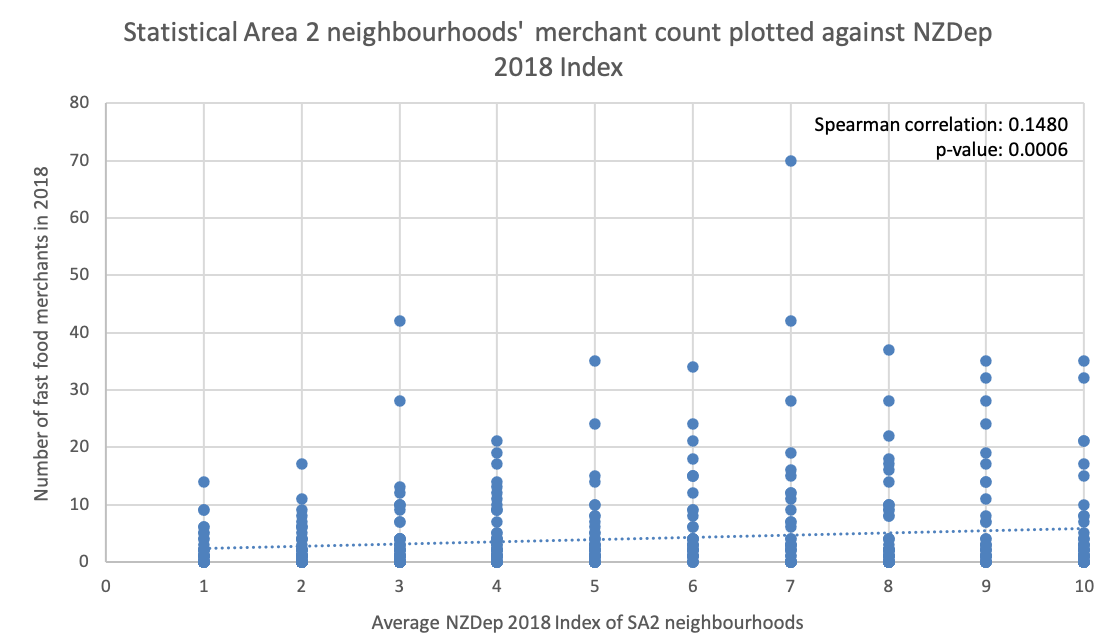
Reviewing the data reveals neighbourhoods with higher levels of deprivation have higher volumes of sales for takeaway items as well as increased numbers of vendors selling takeaway foods.
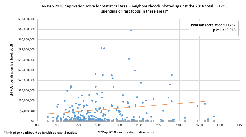
Comparing the top 15 suburbs for junk food sales (2018) revealed 14 were in areas of higher-than-average economic deprivation.
The map below visualises this data. The map overlays economic deprivation (blue-green-yellow) with the number of fast food outlets (orange circles) and the total EFTPOS spending on fast food (yellow diamonds) in each neighbourhood. Click the arrows in the top left to access the legend where these overlays can be toggled on or off independently. Clicking the arrow button to the right of each layer will display the the range of number values associated with each colour or shape size.
This map uses the Stats NZ Statistical Area 2 (SA2) units from 2018 to create neighbourhood boundaries to show the following:
– Neighbourhoods have been shaded from dark blue to yellow by NZ Deprivation score. The higher the score, the higher the level of deprivation in that neighbourhood, with the highest shown in yellow. The lower the score, the lower the level of deprivation in that neighbourhood, with the lowest shown in dark blue.
– The orange circles show the number of fast food outlets for the year 2018, for each SA2 neighbourhood. A larger circle size indicates a greater number of outlets.
– The yellow diamonds show the total EFTPOS spending on fast food outlets for each SA2 neighbourhood, but data is only shown in areas where there were at least 3 outlets. A larger diamond indicates higher annual sales of fast food.
You can access our data and use it in your own research, with the full data set available for download here. This includes:
– Market View Data for the total expenditure over six years
– Market View Data breaking down takeaway spend into Statistical Area 2 units
– Collated spreadsheet linking 2018 spend to the 2018 deprivation index and population data
– Heat maps of areas of Auckland for use in research
– Point files for creation of heat maps and data analysis in statistical analysis tools
Map and graphs supplied by Dr. Kelly Garton of the University of Auckland.
SUPPORT OUR WORK
We are funded by our members and by donations – your support makes our work possible.
Read more